ShopDreamUp AI ArtDreamUp
Deviation Actions


Description
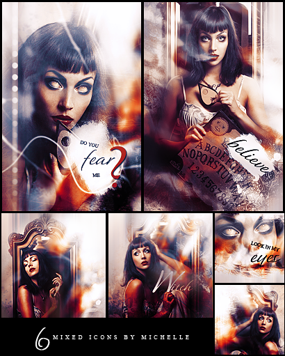
do you fear her..
i hate icons but i really love them
i hate icons but i really love them
Image size
410x511px 365.21 KB
© 2013 - 2024 Miss-Chili
Comments8
Join the community to add your comment. Already a deviant? Log In
You asked for a critique for these? At least I think so here goes nothing.
"Do you fear me" icon: I think this is beautifully done. All I have is personal preference comments to make. For the font, I probably would have moved "me" closer to fear and more to the right, and not angled "do you". This doesn't take away from the overall composition and is merely personal preference. The coloring on her left cheek looks a little grainy; and to the right of her face looks sort of scratched? Not sure if that is purposeful, but my preference would have been to make both softer.
"Believe" icon: My first comment is the fact that the text is very rough around the edges which you can change by using that small drop down. It is something I'd highly recommend playing with. I do also find that the addition of believe makes it too cluttered given the fact that there's clearly readable words on the gravestone. Maybe removing believe and that white area entirely would be better?
Medium left icon: this is absolutely lovely and the lack of text, for me personally, gives it more of an impact since it's more open to interpretation. My only qualm is the fact that the arms are so dark and seem a little grainy. But that is me being nit picky.
Medium right "witch" icon: Again, the text seems a little rough on the edges, and I would have almost preferred this to have no text as well. As it is, I think the placement is of and would recommend maybe trying it up near her head and hand? And I'm not sure why you choose the word "witch" besides that you're making this woman one. Again, her bottom arm is really dark and very orange... maybe try playing with that if you have time?
Top small icon: I really like this one but I feel the text is too much. If anything, I'd have made both fonts smaller and maybe put it across that white negative space. I do enjoy the different composition of this one.
Bottom small: This looks to be merely a resize of the witch icon? I have no issue with it. ^^ I actually really like this cropping.